Friday, December 5, 2014

The new Star Wars holiday postcard designs are in!
Introducing Darth Vader and the EVil Emperor:


And, of course, Jabba the Hut and Admiral Ackbar!


You can buy these festive cards online on my etsy page!

AND….
If you happen to be in Bushwick Brooklyn shopping
at the lovely shops at The Loom, stop in Better Than Jam and find them there!

 Or, if you happen to be in Providence, RI, stop in
Modern Love and find them there

And if you're in Nashville, TN, see them on Woodland 
Street in East Nashville at Art & Invention Gallery


Happy Holidays!
May The Force Be With You


Tuesday, October 21, 2014


I designed and illustrated a new menu for Astoria Bier & Cheese in Astoria, Queens!  I was so honored to draw and create a new design for such a great place. They serve everything from specialty sandwiches and gourmet cheese plates to craft beer, which called for a clean design intermingled with some whimsical food and beverage illustrations. Once I got all the text in place, I decided to do an illustration representing each food category:


As well as some craft beers sold at Astoria Bier & Cheese 
and a legend made out of asparagus and a hot chili pepper:


Here is the final design:


(front)


(back)


If you are ever in Astoria, Queens, make sure you visit Astoria Bier & Cheese
at 34-12 Broadway. It's a heavenly experience! (and check out the menu while you're there)  :)

Tuesday, August 26, 2014

I was honored to be a part of the Tomato Art Show at the Tomato Festival 
in East Nashville this year! Meg at Art & Invention Gallery puts on this yearly 
event, and this year was the 10th anniversary! My submissions included 
Delores Hardy, 1st place peach cobbler in the Jackson County Fair:


The making of Delores


Delores Hardy is the first painting of my new series "County Fair Winners."
I got the idea when I went to a county fair earlier this year in Florida. It reminded 
me of my childhood, attending The Mullet Festival each year 

(mullet = fish, but mullet can also = hairdo)

It is country!!
County Fairs have so many characters to capture! I conducted a grand search 
on the world wide web of county fairs all across the US, mostly in the rural South, 
on the hunt for characters to depict and pair with strange themes and winners of
the biggest vegetable, best corn, best canned beets, a rodeo queen, best dairy cow, 
and of course, peach cobbler.


I randomly googled the name Delores and there she was!


If you happen to be in East Nashville over the next couple of weeks, stop by 
the Tomato Art Exhibit!  It's at Art & Invention Gallery in East Nashville.  
1106 Woodland Street, Nashville, TN 37206

Also featured at the Tomato Art Show are my Star Trek-themed tomato paperweights!


From left to right are Counselor Deanna Troi, Lt. Geordi La Forge, Lt. Whorf, 
and Captain Jean Luc Picard


Thanks to Meg & The Tomato Festival for having me exhibit my characters!


Tuesday, May 27, 2014


My mural got into Edelweiss Magazine!

Last year I created a mural of Kim Jong Il milking a cow on a wall in Astoria Bier & Cheese Broadway in Astoria, NY. As it turns out, Edelweiss Magazine, a Swiss fashion/culture magazine, found the image and wanted to use it for an article they were publishing about Kim Jong Un's affinity for Swiss Emmental cheese! Luckily for me, I have painted murals of both Kim Jong Il and Kim Jong Un. Since Kim Jong Un needed to be milking the cow, I juxtaposed them together to have Kim Jong Un featured.  Voila! 


Just in time for the article to be published!

A big, hearty thanks to Edelweiss Magazine for featuring my painting and being so great to work with.  And another huge thanks to Astoria Bier & Cheese for letting me paint my crazy dictators on your wall.  And last, to all my lovely French-speaking friends who gave me a hand with my French.  Here is a link to the Edelweiss online version.

Merci beaucoup!


Friday, April 25, 2014

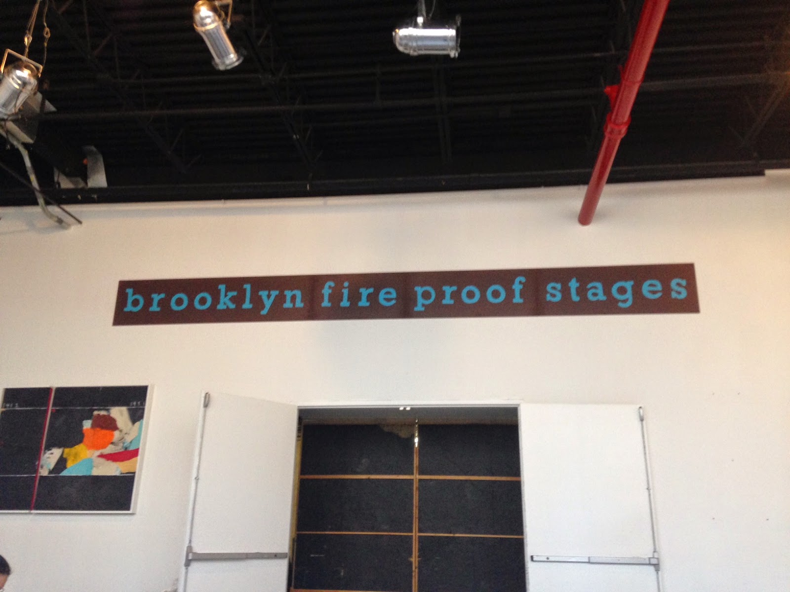
I just finished creating a massive sign for Brooklyn Fire Proof Stages!


The sign was created to make a nice display of Brooklyn Fire Proof Stages's logo in their cool blue handcrafted font inside the lobby of their movie production studio.  They have a lot of really cool projects come through there - from feature films to television shows to music videos! Hopefully this logo sign will end up in some photos, blogs, and publications!


Before I start any project I gather all my materials, do lots of research, and do mockups in Photoshop. Here is a closeup of the logo font that I was to create (about 40 times bigger!):

Mockups I created to see how the sign would look against a natural wood vs a dark stain wood:


The dark brown really works with the fairy tail blue color.
Dark brown wins!


I did some careful measuring and letter cutting to give myself a guide to fit on the sign - creating perfect spacing between each letter is not as easy as it looks! (above picture is not perfect spacing, more of an in-progress shot).  I am so nit- picky that I probably went back and forth and paced the room about 20 times to make sure I had everything spaced correctly.


Check out this view!  I used to have a studio space at Brooklyn Fire Proof and I loved it.  These spaces are awesome, and it was pretty sweet to be able to work in this one!  More info on renting a workspace right here


This is the point where I began my transformation into a smurf


And at last, the sign is complete!


 Here it is, hanging in the lobby of BFP stages!

Tuesday, February 11, 2014

Madame Monocle


During the coldest part of January I got a call for a commission to recreate a portrait I created in 2010 of a nude wearing a monocle entitled, "After Hours," (aptly nicknamed "Miss Monacle"):


After Hours ("Miss Monacle")

I couldn't have been more excited!  I was ready to paint during one of the many snowstorms to occur in New York this winter.  I was overjoyed to recreate her because she was one of my favorites and because it was a birthday surprise for a cool gal I know, a present from her boyfriend. He decided he wanted me to include the necklace in the painting that he bought for her (which I love).  The painting was a surprise (I am friends with her on Instagram and almost posted an in-progress shot - I'm glad I caught myself!)

While examining the old painting, I of course got into my nit picky routine: "Why is that line there, and why didn't I shade that part before?" Ha! So, when I created the new piece,  I got even more nit picky and wanted her to be perfect. It also presented a chance to correct things that needed to be changed in the old version. The rituals after the painting was finished were hilarious - adding hair, then pacing the room, then going back to change her smile, having a sip of coffee, then deliberating on this and that.  As silly and crazy as the deliberating part sounds, it really is such an essential part of the process because it helps me get perspective. Some of the main changes I made were giving her skin a more smooth and balanced quality, making her monacle look more realistic, and changing her expression to look confident and thought-provoking.  I loved adding the necklace to give her a more personal touch, and I think it added balance to the ornament (monocle) she is wearing. From the planning, sketching, painting, deliberating, finishing up, and framing parts of the process, I'm happy how it turned out!  And best of all, the birthday girl liked it.  Hooray!  


After Hours II  ("Madame Monacle")